Trailer Makeover
Renovation creates warm and welcoming space
All photos courtesy the owners
 New wooden floors replaced old carpeting throughout. Furniture inherited from the owner’s parents gives the dining room a classic look. A graceful curve was added to the steps leading up to the living area.
The small home movement may be a relatively new “fad,” but the concept is not new in Maine where many versions of tiny homes dot the landscape. They include mobile homes, which, while utilitarian, are not generally considered architecturally beautiful.
A couple in Blue Hill set out to change that when they decided to renovate a long-unoccupied trailer on property they owned.
Confession: MBH&H asked me to write about this transformation of an unprepossessing mobile home into a charming home because I am a designer who spends her summers in Blue Hill. But I know the owners of this particular house, who are dear friends, and I know the builder, Nielsen van Dujin, as well. So waiving all sense of impartiality here goes.
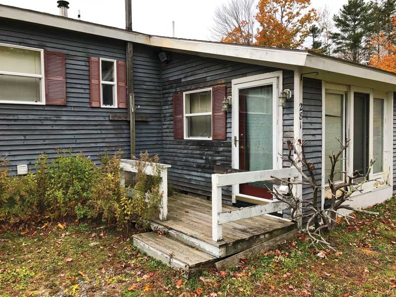
 The front entrance to the kitchen before the renovation.
 The new entrance, which includes a mudroom, features large overhangs, and pine boards with clear finish. Board and batten siding painted red counteracts the building’s horizontal lines.

I have known, or at least driven by, this trailer all my life. But it didn’t enter into my conscious realm until it was purchased by friends, who wanted the land to build a large shed to store boats and cars over the winter months. The house came with the property, and they did nothing to it for years. The home, which is set upon a cement foundation, was used as storage for homeless furniture and art, undisturbed by the wall to wall carpet underfoot or the plastic, faux wood paneled walls. Adding to the awkwardness, a previous owner had added a kitchen to the front of the house at ground level, resulting in an awkward five-step drop from the living room down into the dining area.
Then a few years ago, the owners started thinking about renovating the mobile home for overflow guests, or maybe this new thing called Airbnb. We spoke about it back then; my advice was not to spend too much on the project. Not only was it a trailer, but it is fairly close to the road, and has a giant storage shed behind it.
The owners turned to van Dujin, a local builder and designer (whose daughter is best friends with their daughter, because this is Blue Hill, Maine, after all). He developed a plan, with an eye on budget, that would maximize sleeping spaces, but make as few changes as possible to avoid the expense of moving plumbing in the two existing bathrooms and avoid building a whole new kitchen. The challenge, van Dujin explained, was in “transforming the awkwardness, or ugliness and capitalizing on the beauty already there, embellishing it and bringing it forward.” That said, a key goal was to remove all references to the fact that this had been a 60' mobile home.
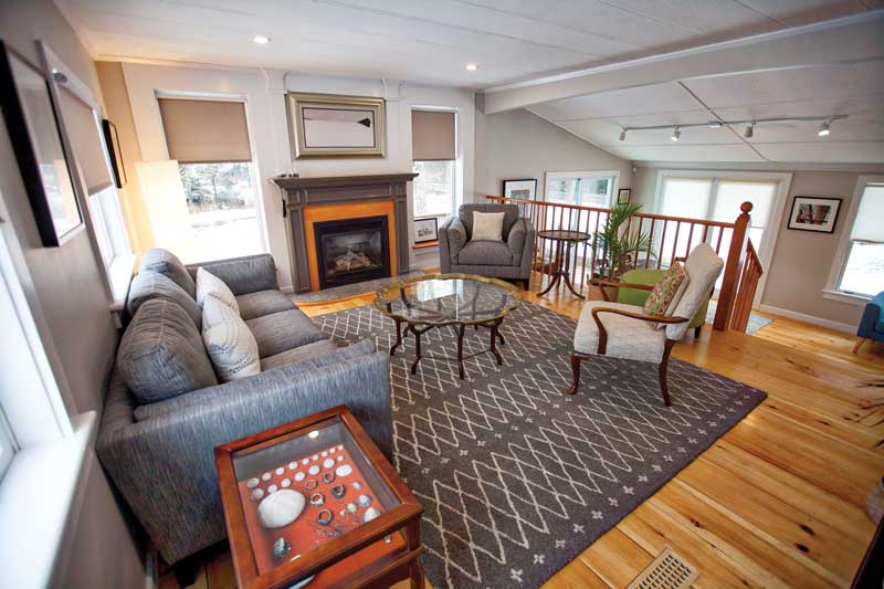
The existing long narrow hallway was transformed with the addition of a graceful round corner; the too-rectangular living room became more square with a fireplace placed between two large windows articulated by a mantle and substantial moldings. Van Dujin found a nice granite hearth stone that had been cut for someone else but rejected. The carpeted floors were replaced by wide pine boards, and the faux wood paneling was replaced with sheetrock. The hollow-core doors were upgraded to real wood doors. When all that was done, the original particle board ceiling remained, covered with transformational coats of white paint.
 The original kitchen cabinets were refinished and enhanced with new hardware.
 In the living room, the new focal point is the gas fireplace and flanking windows. The railings on the bannister, which replaced a previous wall, are made from off-the-shelf copper plumbing pipe.
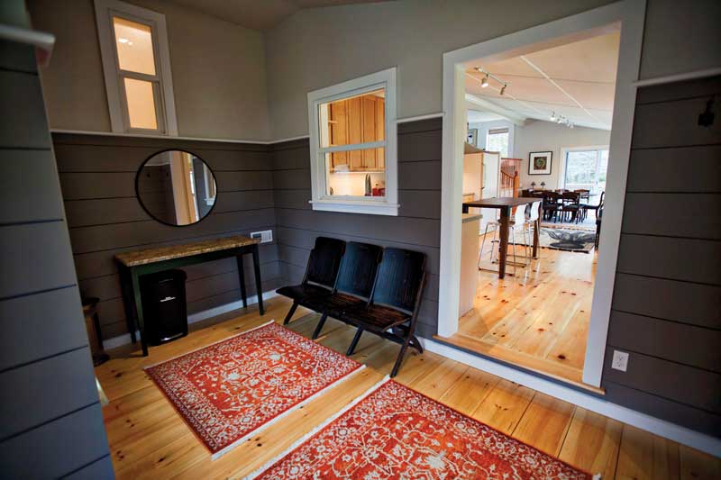
 The walls in the new mudroom off the kitchen are painted a soothing aubergine color.
The new hallway into the living room, which was moved from the exterior wall, to the space between a bedroom and the kitchen, gets borrowed light from the bright kitchen through four rectangular openings in the wall. Van Dujin removed the wall dividing the living room and kitchen and replaced it with a hand railing featuring balusters made from copper piping purchased from a plumbing supply store—it will patina naturally. The stair connecting the two rooms now has gracefully curving steps—that detail, and the time it took to execute it, say plainly someone cared about making this space.
A manufactured home is by design not “of a place,” van Dujin said. So he worked hard to ground the building to its site. The roof overhangs were increased. The horizontal lines of the existing exterior siding were replaced by vertical board and batten painted a New England red. Key to the exterior transformation, he noted, was a new entryway that “dovetailed the long trailer, and the previous addition and the entry became that interlocking element that created cohesion and a gateway to the home.”
Van Dujin likes entrances, though I don’t mean making one of his own, as he is rather unassuming and even shy. He gave a lot of thought to the physical entrance to this house, working through the details as the project progressed. The owners wanted a mudroom off the kitchen. This made sense as it would be the entrance used most often. But this was also where the roof of the original trailer intersected with that long-ago kitchen addition. The solution was to extend the roof to create a small porch, adding posts with subtle boat-like knees. He also changed up the siding here, using horizontal pieces of clear pine.
All of those decisions add up to a total transformation: the renovated house feels welcoming and solid, not at all like a mobile home.
Martha Coolidge is a sailor and designer specializing in boat and home projects. Martha Coolidge Design is based in Rockland.
Related Articles
Share this article:
2023 Maine Boat & Home Show

Join Us for the Maine Boat & Home Show!
Art, Artisans, Food, Fun & Boats, Boats, Boats
August 11 - 13, 2023 | On the waterfront, Rockland, Maine
Click here to pre-order your tickets.
Show is produced by Maine Boats, Homes & Harbors magazine.


